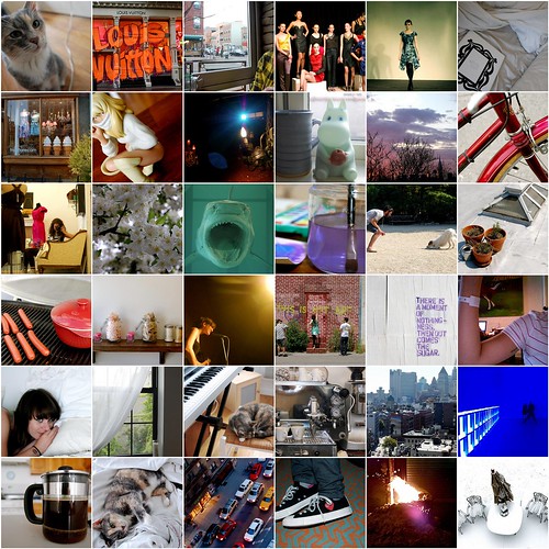
[captions & indiv links here]
And some highlights...


Have a safe and happy 2010 everyone. See you next year!

He started by hiring USC linguistic expert Paul Frommer to invent an entirely new language for the Na’vi, the blue-skinned natives of Pandora. Frommer came on board in August 2005 and began by asking Cameron what he wanted the language to sound like? Did he want clicks and guttural sounds or something involving varying tones? To narrow the options, Frommer turned on a microphone and recorded a handful of samples for Cameron.Amazing. Check out this mini "making-of" clip:
The director liked ejective consonants, a popping utterance that vaguely resembles choking. Frommer locked down a “sound palette” and started developing the language’s basic grammatical structure. Cameron had opinions on whether the modifier in a compound word should come first or last (first) and helped establish a rule regarding the nature of nouns. It took months to create the grammar alone. “He’s a very intense guy,” Frommer says. “He didn’t just tell me to build a language from scratch. He actually wanted to discuss points of grammar.”
[...] Cameron hired Jodie Holt, chair of UC Riverside’s botany and plant sciences department, to write detailed scientific descriptions of dozens of plants he had created. She spent five weeks explaining how the flora of Pandora could glow with bioluminescence and have magnetic properties. When she was done, Cameron helped arrange the entries into a formal taxonomy.WOW. I would love to hang out with someone with such an insane imagination and tenacious attention to detail. This is just the tip of the iceberg, too – Cameron even had Pandora's atmospheric density calculated. Are you going to see this movie? I'm not that big on this type of science fiction, but I might have to be now.


The area of each coloured wedge, measured from the centre as a common point, is in proportion to the statistic it represents. The blue outer wedges represent the deaths from: preventable or mitigable zymotic diseases, or in other words contagious diseases such as cholera and typhus. The central red wedges show the deaths from wounds. The black wedges in between represent deaths from all other causes. Deaths in the British field hospitals reached a peak during January 1855, when 2,761 soldiers died of contagious diseases, 83 from wounds and 324 from other causes making a total of 3,168. The army's average manpower for that month was 32,393. Using this information, Nightingale computed a mortality rate of 1,174 per 10,000 with 1,023 per 10,000 being from zymotic diseases. If this rate had continued, and troops had not been replaced frequently, then disease alone would have killed the entire British army in the Crimea.The way this chart came about began with how Nightingale saw hospitals being run. Conditions were unsanitary (to put it lightly), and she wanted to see reform in the entire hospital system. Being a woman during this time made it pretty hard to get heard, so she decided to observe and write down the causes of death she was exposed to over a period of time through her own record-keeping system to see if she could make a convincing case for reform. Eventually she had amounted so much data that she was seeing patterns in (too many deaths that could have been prevented, essentially (the blue wedges)) that she did some calculations and finally did have a solid case. In brief, that mortality rates could decrease if some changes were made within city and military hospitals.
The bus is generally considered to be the most loathed form of public transportation. People, as a whole, do not like to ride the bus. A google search for “I love buses” turns up 217,000 results. A google search for “I hate buses” turns up 2,890,000 results. (...) Our culture’s hatred of buses even sneaks its way into our idioms—of late, to “throw [someone] under the bus” is a phrase that means to sacrifice another person for personal gain, even though throwing someone under a train or into the whirling propellers of a helicopter would almost surely result in more gruesome consequences.Enter Bus Rapid Transit (BRT). It's still a bus, but it's operationally different in a lot of ways. For one, dedicated rights-of-way: buses get their own lanes. One result of this is that they are seen as a unique form of transportation, rather than another vehicle sharing the road with everyone else. Dedicated bus lanes are also a lot more efficient (more on this soon).
To be fair, the bus has rightly earned some of its criticism. There is a plethora of reasons people do not like buses, and while all of them are not present all of the time, some of them are present most of the time. Buses can be unreliable and late, and when they do show up, they sometimes show up in pairs, or more insultingly, in groups of five. Waiting for a bus at a conventional pole-and-sign stop can be a cold, wet, and even dangerous adventure. A bus ride on a heavily-trafficked corridor with many stops is slow and lurching. Hardly any transit mode in the world can be considered more unpleasant than a standing-up ride on an overcrowded bus while carrying six shopping bags or an infant.


Bus bunching occurs when one bus, due to traffic, a late start, or any other reason, is a little behind schedule, and as a result, arrives at each stop to see more people than usual waiting to board. Because it takes longer to board more people, the bus arrives at each subsequent stop more and more behind schedule. Meanwhile, the bus behind it—the next bus running the route—does not have a large number of passengers to pick up because any of those passengers who were early enough to be there when the earlier bus came by in all its lateness boarded it instead. By the end of the route, the second (or, when it’s really bad, third, fourth, or fifth[!]) bus will have caught up with the first bus, and the bus arrives very late and in multiple.There are other factors that can set BRT apart from regular bus transit as well, to get commuters over the psychological barrier against them. The buses themselves look different, the stations are more sleekly designed (sometimes with modern logos and bright color schemes) and are built to accommodate pre-boarding fare collection. Here's an example from the RIT in Curitiba, Brazil, one of the most successful BRT systems in the world:

It is as though people are known to hate buses so deeply and thoroughly that the only way to trick them into riding one—even if it’s a bus with none of the problems of a conventional bus—is to disguise it with an Orwellian name change, a la 1984: But the Ministry of Love is still where people get tortured, and “Commuter Rapid Transit” is still, technically, a bus.I recently spotted a PSFK article about the MTA investing further in more efficient bus transit, but the link seems to be dead (see? a sad, dead link). I did find This MTA page on their SBS Project that explains BRT really well, and explains how they envision BRT fitting into New York's transit system in the future. Exciting! Maybe it'll turn bus riding reluctance in NY around?

Almost all of the photography projects I'm ever involved with deal with time in some way. This, paired with my desire to visit Spiral Jetty in Utah by myself one day, made How to Conserve Art That Lives in a Lake? a pretty great find last week.
I had a dream about a year ago in which I found Spiral Jetty leading off of a beach on a tropical island, and walked to the end of it in a vast silence. It took me a few hours of creative Googling the next day to figure out whether or not this place actually existed, or if I had quite literally dreamed it up. It turns out that I learned about it in my AP Art History class in 2000, and it chose eight years later to show up in my subconscious. Ever since, I've wanted to buy a plane ticket to Utah and walk out to the middle of it by myself. Bud almost gave me a heart attack when I half told him this story a couple of months ago and he responded with, "I don't think that actually exists anymore."
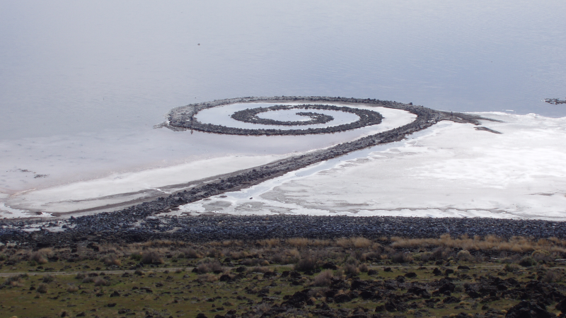
Well, he was half right, it turns out. Apparently it was submerged for decades, and droughts caused it to resurface recently. Robert Smithson (the artist) was always into what the passage of time did to his works, and it's too bad he didn't live to see it come back out of the water. It looks a lot different now; salt and silt have whitened it considerably, and over the years people have also taken pieces of it with them as souvenirs.
The photography part of it comes in with Dia, the art foundation that owns the piece. They wanted to find a way to photograph Spiral Jetty longitudinally to see how the passage of time's effect on it could influence conservation efforts in the future. Because it's so huge, it was hard to figure out a way to do this without blowing through thousands (millions?) of dollars. They finally got there with a latex weather balloon, helium, fishing line, assorted tools, and a point-and-shoot. Pretty awesome, no? Anyway, I was happy that the article brought it back into my consciousness. I still want to go, too. Does anybody know if people are even allowed to walk to the end of it?
I went to Chelsea today intending to visit one gallery, and ended up going to more than ten. It's a really, really good time to make the trip there, and I stumbled upon a few things that delighted me so much I was hopping in place.
Luke Smalley @ Clampart
It started with Luke Smalley. He passed away this past May, and Clampart is hosting a memorial exhibit of his Sunday Drive series. I haven't been this impressed with photography since I discovered Jeff Wall's light boxes by accident. The pictures are pretty big, and the colors and lighting are beautiful. The story is that three girls are taking a road trip to a prison where their boyfriends are incarcerated, and the boys are killing time until they arrive.


[images from clampart.com]
Chiharu Shiota @ Goff + Rosenthal
I think I was in disbelief when my friend Joe and I walked by Goff + Rosenthal and I saw the tangle of black threading through the door. I just found out about Chiharu Shiota two or three months ago, and have thought about her every few days since then. Her work has a lot of thread tangles (black and red), windows, pianos, and long dresses in it. This exhibit featured some sprawling black corners and boxed-in tangled objects (my favorite was a hardcover pocket book) suspended in black tangles. This was the most pleasant surprise of the day.


[images from chiharu-shiota.com]
Dan Flavin @ David Zwirner
I visited this one a couple of weeks ago with my friend Dan because I love light installations and I love Dan Flavin. I loved it so much that I had to go back today. I might make a fake one of these for my apartment one of these days. There's a huge room with pink and gold lights, and another part of David Zwirner with multiple rooms (each for a different color or color combination). My favorite might be the white room, even though the blue one is probably the most striking.


[white and pink & gold from davidzwirner.com]
Basquiat @ Stellan Holm Gallery
Wow! Walking by Stellan Holm and seeing this made me gasp like a complete creep. It's a small exhibit of some large Basquiat drawings. Made me smile and want to pour syrup all over a tabletop.

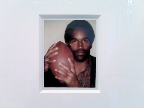
Andy Warhol @ Danzinger Projects
Double wow! This one at Danzinger Projects is called Greatness, and is a collection of Polaroids Warhol shot of famous athletes in the 1970s and 1980s. Think Muhammad Ali, Dorothy Hamill, and (yikes) OJ Simpson. Here's a good slideshow on The Moment.
Other highlights of the day included Kim Cogan @ Gallery Henoch (really pretty oil paintings of NYC scenes); Hockney @ PaceWildenstein; and John Wesley @ Fredericks & Freiser (Googling John Wesley only to find that there was an Anglican cleric by the same name is the most hilariously ironic thing in the universe. Click through only if you dare. NSFW.)