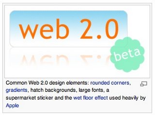
I found this visual example of Web2.0 on Wikipedia just now. I know this graphic isn't supposed to be humorous, but the way it lumps all of the very-true design elements of Web2.0 into one image amuses me. It seems almost like a parody, like the cartoon strip in my previous entry.
EDIT - Clay Parker Jones of exitcreative just sent me the link to a Web 2.0 logo generator. It's hilarious.
