
Today I read this Lagerfeld quote in a NYTimes piece about fashion in today's economy:
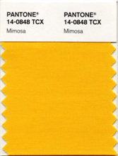
“This whole crisis is like a big spring housecleaning — both moral and physical,” Karl Lagerfeld, the designer for Chanel, said in an interview. “There is no creative evolution if you don’t have dramatic moments like this. Bling is over. Red carpety covered with rhinestones is out. I call it ‘the new modesty.’ ”This is an interesting juxtaposition to see alongside the "bright" trends and predictions for 2009. A month or two ago, I read about Pantone selecting Mimosa for their color of 2009. The economy was also the inspiration for that – "In a time of economic uncertainty and political change, optimism is paramount and no other color expresses hope and reassurance more than yellow."
Fast forward to this week, when my friend Jess predicted lots of neon for 2009 fashion, Flavorpill predicted "bright bold colors" for home design and Michael pointed towards some recently-seen brightflash on his blog. And let's not forget the (very loud) Louis Vuitton x Stephen Sprouse collaboration, which is hard to avoid if you work on the same block as the SoHo store.

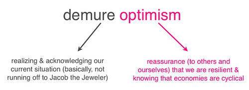
Which is it, then? Upon first reading these two "opposing" points of view, one might think in a "subdued vs. bright" direction, wondering which one would end up prevailing. But since I've been thinking about extremes working together recently (my February column is about this), I am thinking that they'll do just that: work together. I don't think fashion only has to be a counter to the shit economy in the form of technicolor, kaleidescopic strobe lights, but I also don't think it only has to remain dour, defeatist and beige.
Two examples (both related to links I've already tossed around in this entry) could be seen in things like GAP's new popup Pantone Mimosa store (they have solid mimosa-colored tees) and the sort-of-recent I ♥ NY shirts in different solid colors.
So, maybe the Louis Vuitton x Stephen Sprouse thing will be an anomaly in terms of bright and chaotic for the coming year. Bright spins on classic styles seem to make more sense, each element balanced and keeping the other in check.
F, I didn't even realize until just now that I was describing American Apparel. Well, aybe aside from clever merchandising, that's unconsciously been another reason why they're one of the only retailers profiting in this climate.