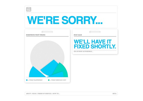
This one was four or so months ago on Daytum:
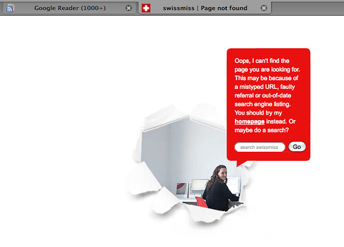
Here's the swissmiss one I got a few nights ago:
And this morning: Firefox.

[click all for bigger if you can't read the text]
One would think error pages would = annoyed, I-just-want-to-use-the-site /find-what-I'm-looking-for thoughts, and they usually do... but these were disarmingly on-personality with each of the respective sites. Taking the time to put some effort into the little details and assuaging (hopefully infrequent) frustrations when things go wrong can go a long way, I guess*. I kind of want someone to do a psychological study on the effects of a disappointment framed in a charming way. Each of these times I smiled and forgot what I was even looking for or trying to do, and I was left with a positive feeling toward the site. An error page delighting someone? Pretty neat.
What are some of your favorites? Please share a screen shot or two if you can.
* One factor that matters though is obviously frequency: I have only seen each of these error pages only once. They can be as cute or clever as they want, but if they happen all the time (I'm looking at you, Fail Whale), they can somehow end up more maddening than a default error page. Over time, I began associating that whale with the Microsoft Office paper clip.
EDIT | The wonderful Amber just showed me this one she got at Sephora.com once:
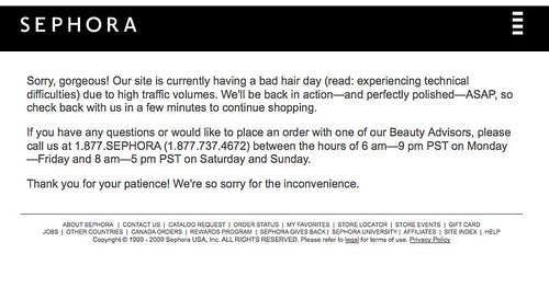
Thanks Amber!