What I'm talking about is mobile technology. I've had to think about it a lot lately, and well, it's no secret that we're far behind the rest of the world when it comes down to it. Actually, all I had to Google (for support) after writing that sentence just now was "mobile technology america behind" and got to this wonderful bit. And that was the same point I was going to make.
(Let me back up for a minute. I am writing this while Oceans Thirteen plays on my television dubbed in Japanese. Know what that means? I am in Tokyo! Those who know me (even those who don't, perhaps) will know that I have been longing for this time for ages.) *
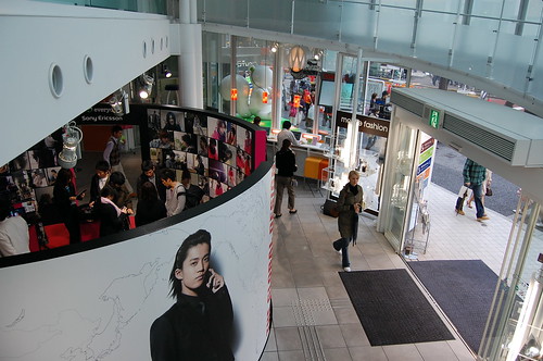
So, back to what I was going to share. Today I was frustrated and tired after being stuck in Warp Zone (which some like to call Meiji Dori), and instead of finding the store I wanted (Laforet), I wandered into a five-story, circular building with the same internal architecture as the the Guggenheim. I think I was drawn to it because there was a lot of stuff happening in there - computers, lights, flashy larger-than-life images of well-dressed models holding cool devices, etc.

The guy working the first floor was very proficient in English (and he liked to practice, I think), and he was telling me all about this structure. Apparently it is owned by KDDI, which is mobile carrier and ISP in Japan. It's called the KDDI Designing Studio, and each floor does something different. In order:
1. Live Lounge - free Internet on four computers (one of them ONLY runs Second Life, which was amusing) and a huge center-floor Sony Ericcson display
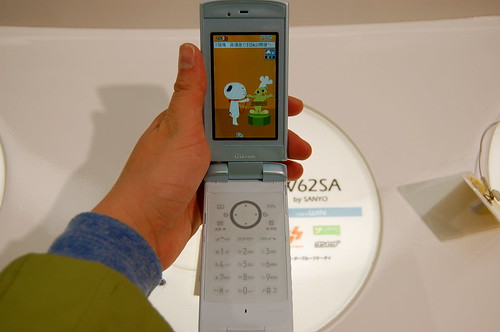
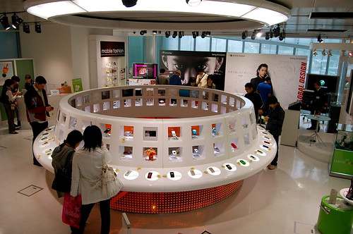
2. au Design Park - the newest concept models are displayed here (including the very rectangular and very flat flip phone styles I have seen on Gizmodo), space station-style:


3. KDDI Portal Living - new experimental technology is demonstrated (you can try it out too); right now includes a broadcasting service and a Sony /au music collaboration (I think au is a handset manufacturer)
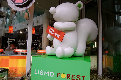
4. Lismo Forest - this was a surreal, storybook-like forest setting, featuring LISMO (an online music service run by KDDI)'s mascot:

5. Wired Café 360° - must have missed this one... the pamphlet I took calls it an "urban escape," while my English-speaking friend stressed that I could get a beer there.
This Designing Studio was awesome. Yes, we have all heard about "creating an experience for the consumer" a million times. Well, duh. I had quite the nice time walking through it and touching the shiny
I'm sure that in the minds of people who live here and are familiar with these brands, they all live together. I am trying to think of a relevant U.S. example (help me out if you can think of one), but I'm pretty sure there is a competition problem – in addition to an infrastructure problem – in North America. Carriers are – from what I have seen – obsessed with taking over the user interface of their devices (among other things). I think I had an LG VX450 before Verizon started doing that, because I remember very pretty dandelion wallpaper with purple trim and very intuitive UI in 2004. Well, when I got a RAZR two years later (for very few months, please forgive me), the UI was terrible. And it was RED and I couldn't get it to NOT be red. Because of this, there were two separate components in my mind: Motorola (handset) and Verizon (carrier & user experience). Not "one, single, streamlined" mobile experience. This entire KDDI Designing Studio felt cohesive, and I mostly had no clue that there were at least four brands working together in this space until I did some research. I wonder when something similar can happen in the U.S. (if ever). I would love it.
(I would also love to hear thoughts on this, please share! I just kind of started typing without a real point or end opinion on how things can change.)
* If you want to read more about my trip (including photos), check out my Tumblr page. Oyasumi nasai (good night)!