
At first glance, pretty standard display ads, right? I like the placement, though, since there are tons of Dunkin' Donuts locations all over New York, and this is a site about getting all over the place in New York.

Now let's scroll down a little...

Here's a closeup:
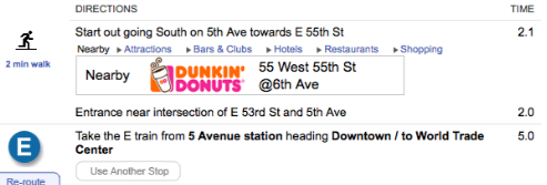
Normally, I would be pretty annoyed to see an ad in the middle of content I'm trying to read; but look at what they did! They saw where I was starting my trip and told me where I could get coffee for the ride just two blocks away. Let's scroll some more...
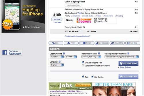
There it is again! In case I was running late and hadn't wanted to walk an avenue out of my way, here is another Dunkin' Donuts smack in the middle of the next station and my meeting. I know that the algorithm used to generate these locations wasn't thinking about it in this way, but advertising the presence of more than one location gives options, which (to a point) can be a convenient thing.
Reading up on Dunkin' Donuts early last year taught me a bit about their rebranding efforts: they de-positioned the "fancy coffee" market and played the "efficient for people on the go" card (quick in-and-out, "just give me my coffee" service vs. the "relax in a big comfy chair and pull out your laptop" culture surrounding Starbucks). To me it fits pretty perfectly with someone looking up directions to get somewhere in the most efficient way possible. As Dunkin' Donuts says in their most recent ad, "We don't work around our schedule, we work around yours."
So, yeah, this isn't the sexiest looking thing in the world:
But it's the smartest placement I've seen in a while; it just works & makes sense.
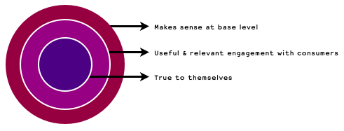
This week's NY Magazine quotes Twitter co-founder Biz Stone describing straightforward web advertising as feeling "tacked on." Definitely not so in this case, and telling someone where they can grab coffee on-the-go is pretty straightforward. Dunkin' Donuts didn't just stop at the "two brands relevant to New Yorkers" part; they went deeper to a) make sure that they were giving people something they could use; and b) made sure that it made sense for what their brand stood for. Good work, guys.
*The "more" part of this post's title references the fact that I've mentioned Dunkin' Donuts one two three four five six times on this blog so far. Yeesh, I should cut it out, shouldn't I.
[x-posted to House of Naked]